Almost a year ago I travelled to The Netherlands to visit my mom. I had a lot of time by myself while I was there and decided to play tourist in my own (former) country. In 2013, the Rijksmuseum opened its doors again after 10 years of renovation. I had been there since, and seen all the famous pieces that draw in all the tourists. But the museum is big, and there are a lot of things you will miss. So this time I decided to go there, skip all the usual, and find all the hidden gems. In the brochures online I had seen that there was a dress by Yves Saint Laurent, inspired by Piet Mondrian, a Dutch painter. This seemed like something I should not miss.
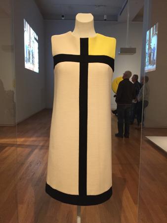
It is displayed all the way at the top of the building, in a far-away room. Unless you know what you’re looking for, are dedicated to see everything in the museum, or you’re lost, you would never find it.
This dress is part of a collection that YSL made in 1965 and became very popular after being on the cover of Vogue.

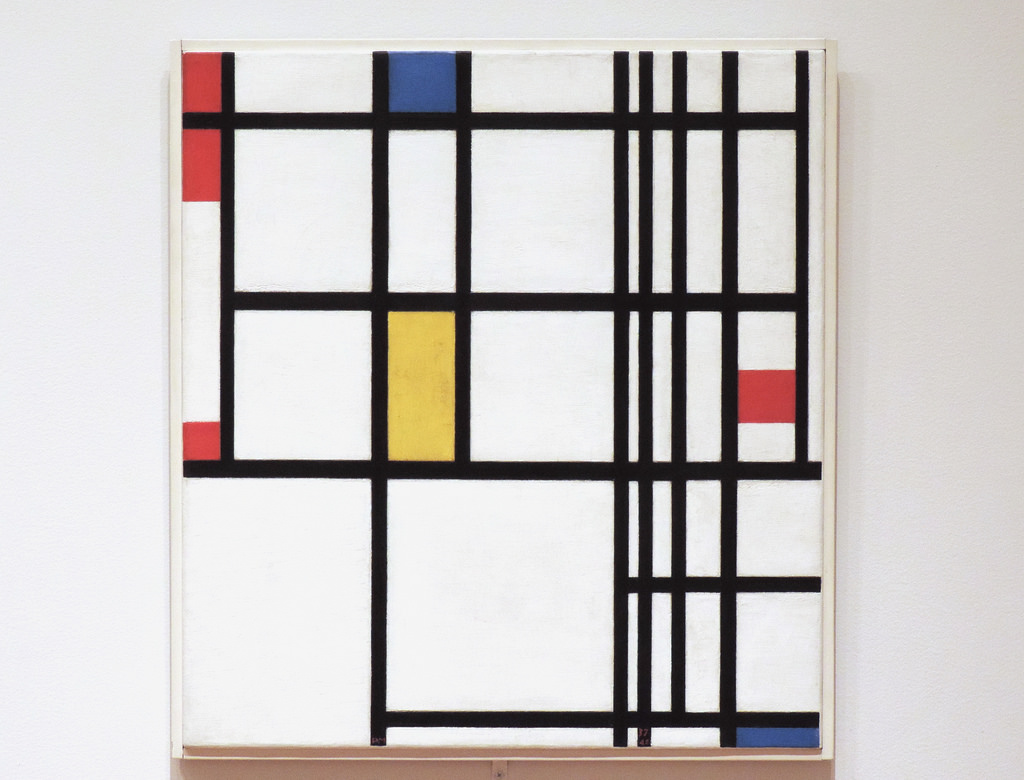
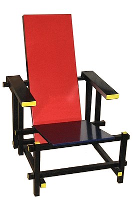
But to be honest, I wasn’t impressed. When I think of Piet Mondian, I think of more complex works. And the chair Rietveld made. This dress just left me wanting.

I spend quite some time looking at it from all angles. And I kept getting back at the same thought; I can do this better, with a shirt.
Weird, thinking you can improve on a famous designer. Although I wasn’t going to set out to create a new fashion trend, like YSL had done, it did seem rather arrogant. Yet the seed had been sown, and there was no turning back.
As with any bold adventure, it is very difficult to take the first step. I just let it play through my mind every now and then. The easy way would be to take one of his paintings, distribute it across some pattern piece templates on my computer, have it printed by Spoonflower onto fabric, and make a shirt. I have done that a couple of times with different art shirts. This seemed like the easy way out. And I didn’t think this would produce the vibrant colours that Mondrian used.
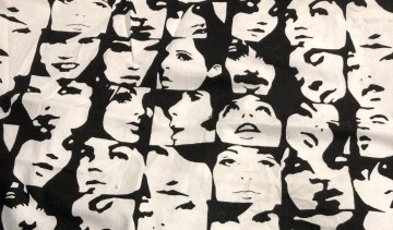
The alternative would be to create the cloth myself out of individual pieces of fabric. For that I would need to find the five colours – white, black, red, blue, yellow – in the same fabric. Looking at a couple of quilt shops did not provide me with what I wanted. The online store where I normally buy my trousers fabric, SellFabric.com, did.
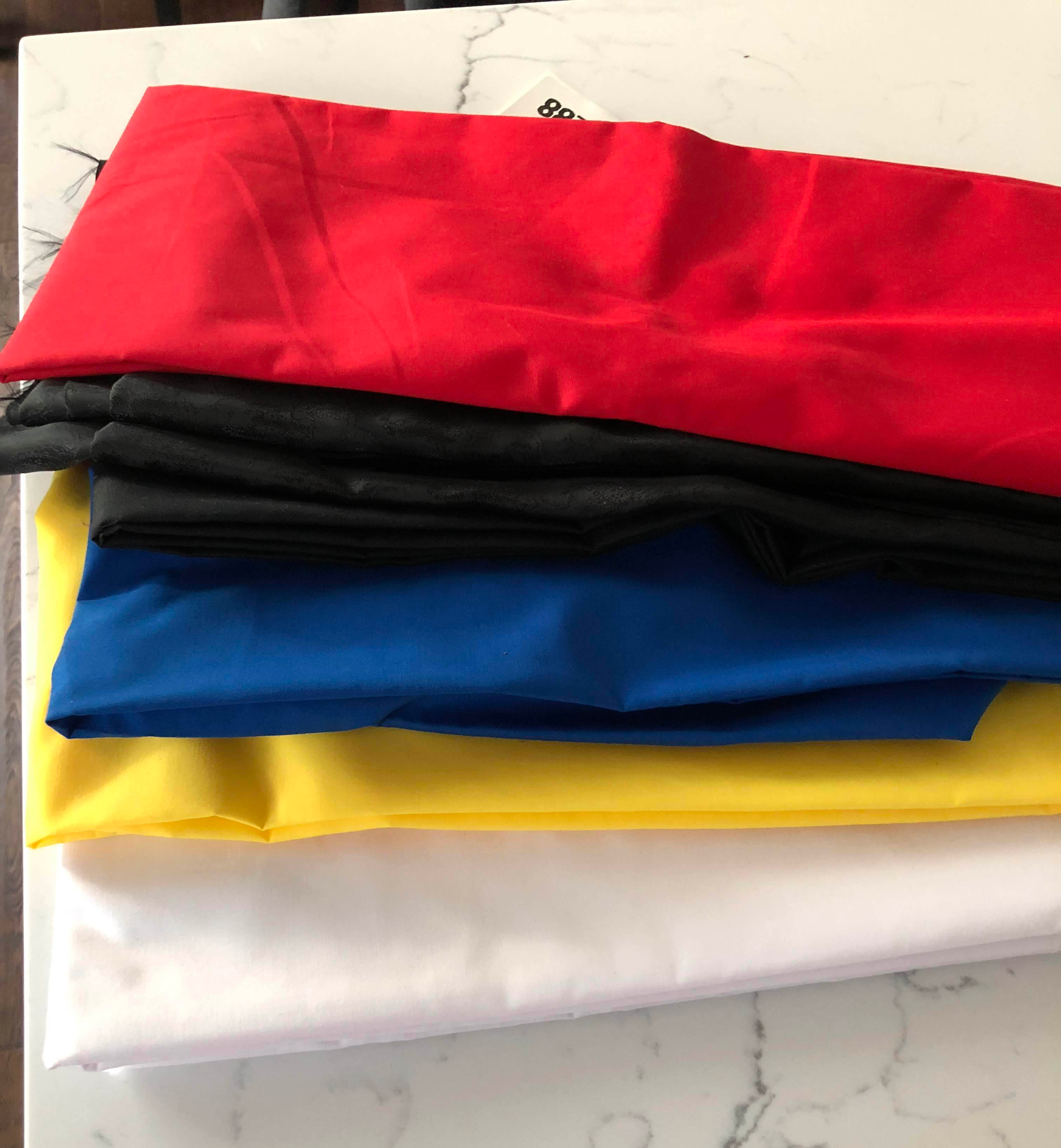
The right weight, nice drape, nice colours, good price. The later was especially nice, considering I would need a yard of each colour and two or so of white. The only issue I found was that it bleeds like crazy. I must have washed each piece at least 6 times separately, adding Retayne to two of the washes. Eventually it stopped turning the water the same colour as the fabric. I’m not sure I trust it enough to actually wash the shirt once I’m finished.
With this hurdle completed, it was time to make the design. What an opportunity to procrastinate! “Let’s think about this for a while.”
Of course, you can only tell yourself that for so long before you get cross with yourself.
I took an image of a dress shirt, removed as much detail as possible, and made a bunch of copies. This would let me design straight onto the ‘canvas’ and see what it would look like. One of my daughters provided crayons in red,blue, yellow, and black. Perfect!
This is a lot harder than I thought. The right combination of coloured areas, and the distribution of them and the black lines on the shirt, turned out to be anything but easy. All the while allowing for construction of the shirt.
I wanted the shirt to have a normal opening in the front. That basically gave me three options; a narrow placket the size of a black line, a normal sized placket, or a wide placket the size of the neck opening (like a double-breasted shirt). Using a narrow placket seemed to be problematic. The black lines should be really narrow, and that would allow the front to open between the buttons and show your chest. So I considered only a normal sized placket, and a wide one.
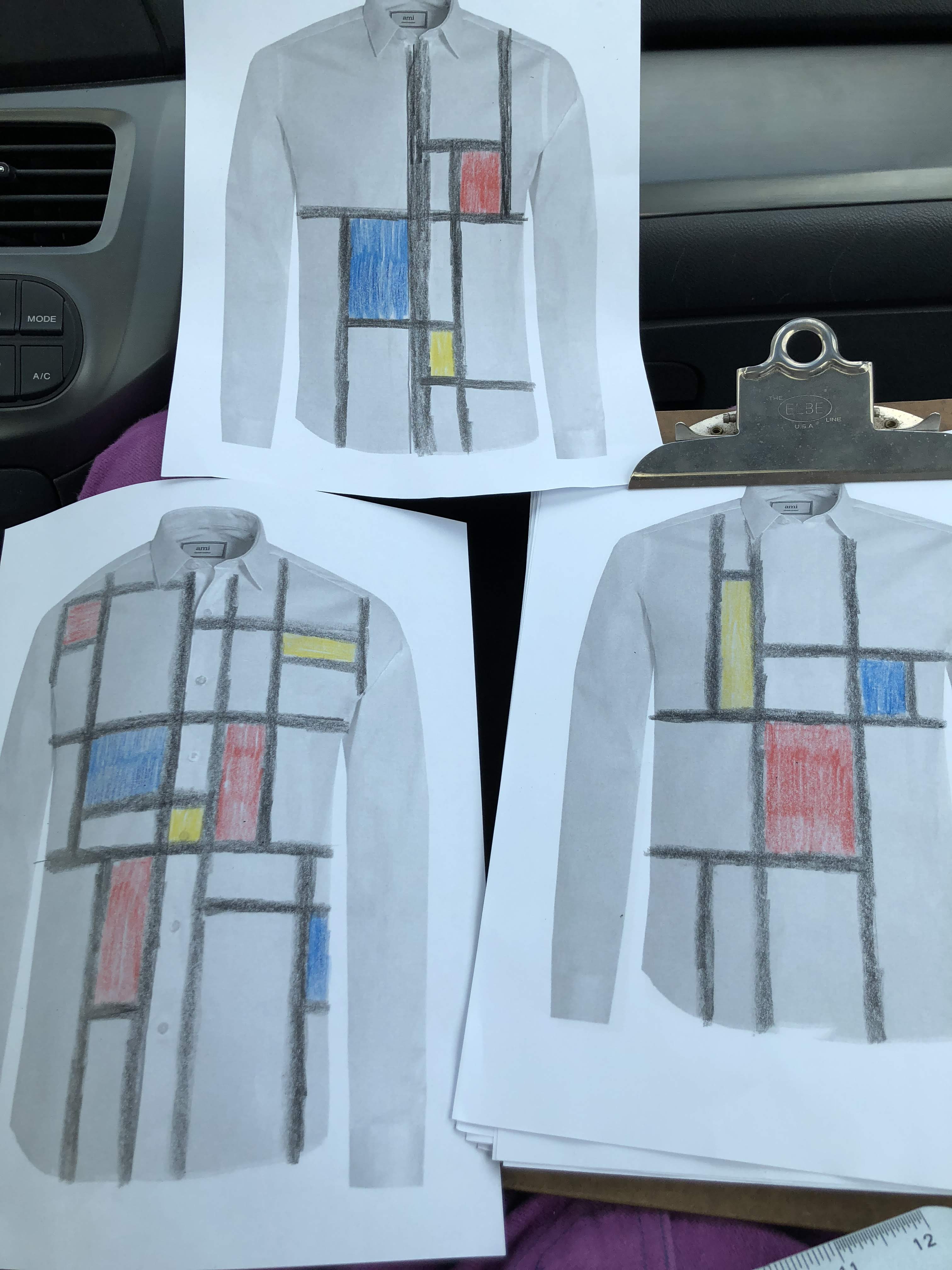
These to the left were my first three attempts. None of them I liked at all. Now, I’m not an artist, so that should not really have been a surprise to me.
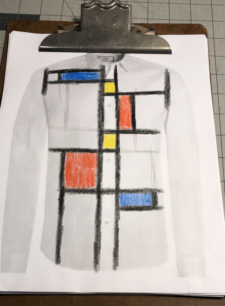
Although I didn’t really know what was wrong with each of them, they did help me to sort of intuitively improve with each iteration. I would make one new attempt every couple of days to a week. The wide placket variation, which you see on the right in the photo, was voted out pretty soon in the process. I just didn’t really like how that looked. The numerous tries after that decision resulted in a table full of attempts and one I was finally happy with.

By now I was 8 months into the project, and needed another (procrastination) break.
 I cut out the fronts, making sure I would match the pattern in the front. Then cut out the contrasting placket, and matching that to the underlying front pieces too. To make sure I had everything lined up correctly, I laid it out on my cutting table. And then it happened; my brain started going off the deep end again.
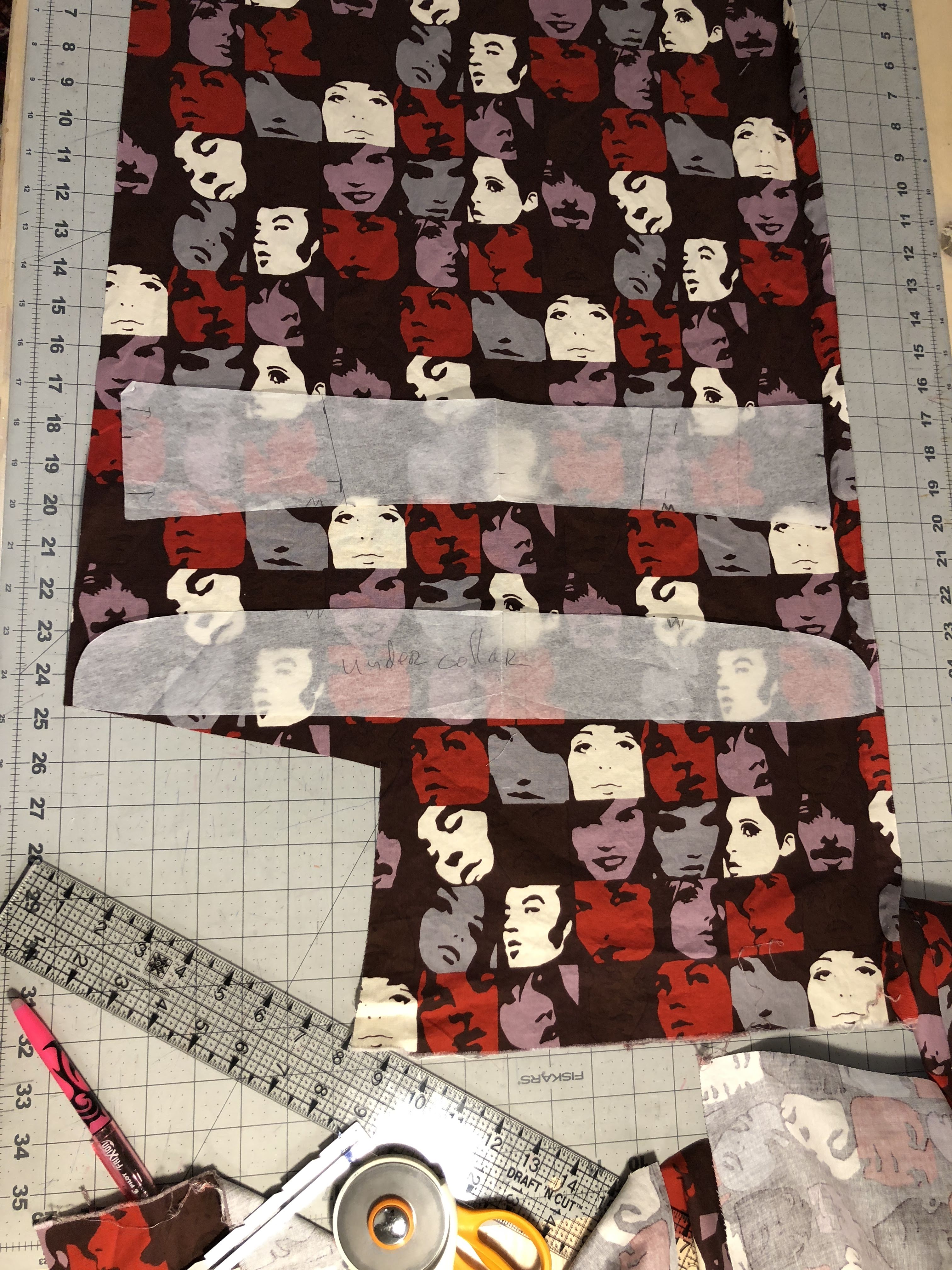 Of course, all of this would have to match the fabric pattern. So the challenge began of getting each piece out of the limited amount of contrasting fabric. With the placket on the sleeves being at a slight angle, that was not as easy as it initially sounded. I had to change how to cut the sleeves from the main fabric to accommodate what contrasting fabric I had left. And even then, trying to get the collar and collar band to fit in the remaining fabric almost didn’t work.


