Mondrian shirt – Completion

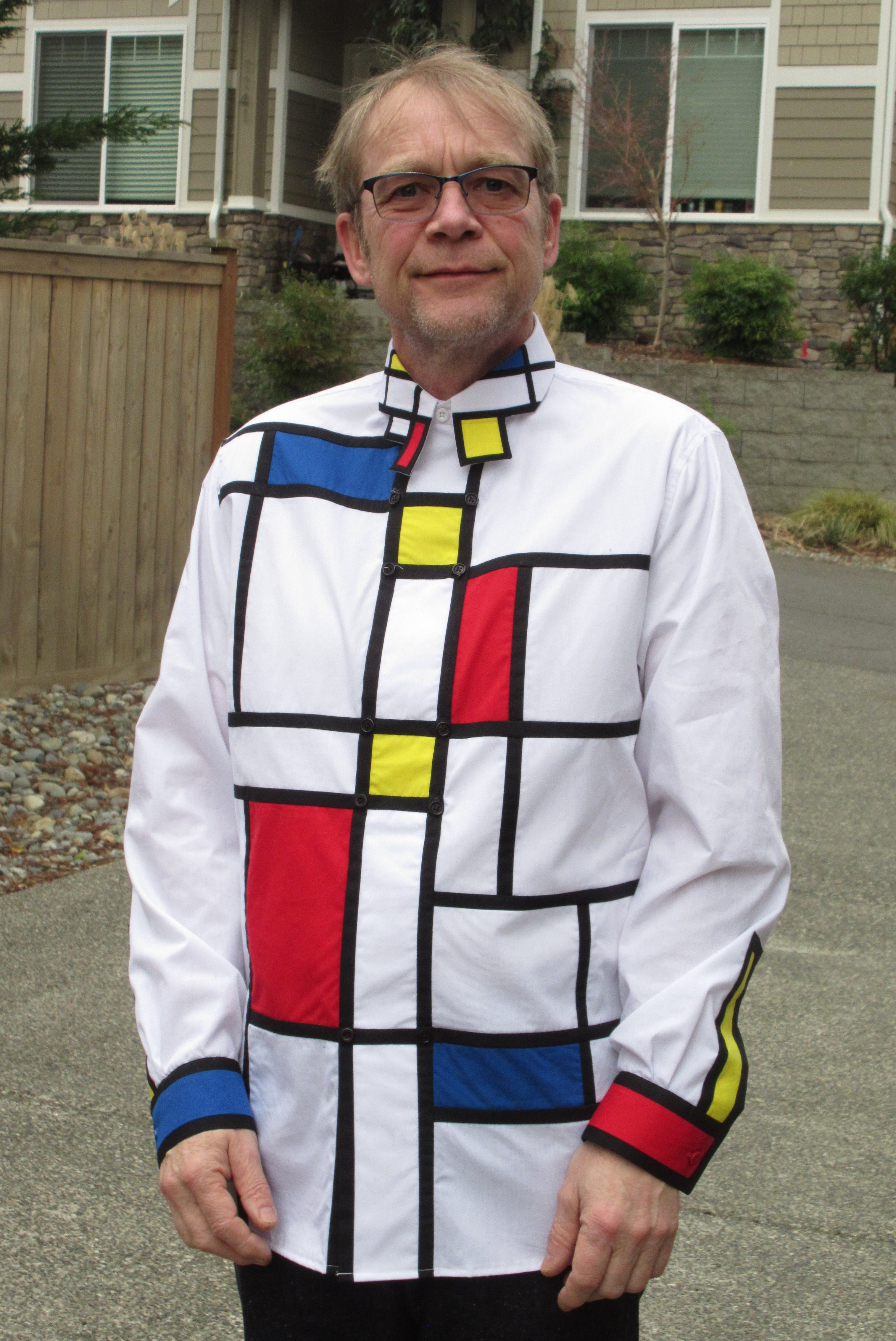
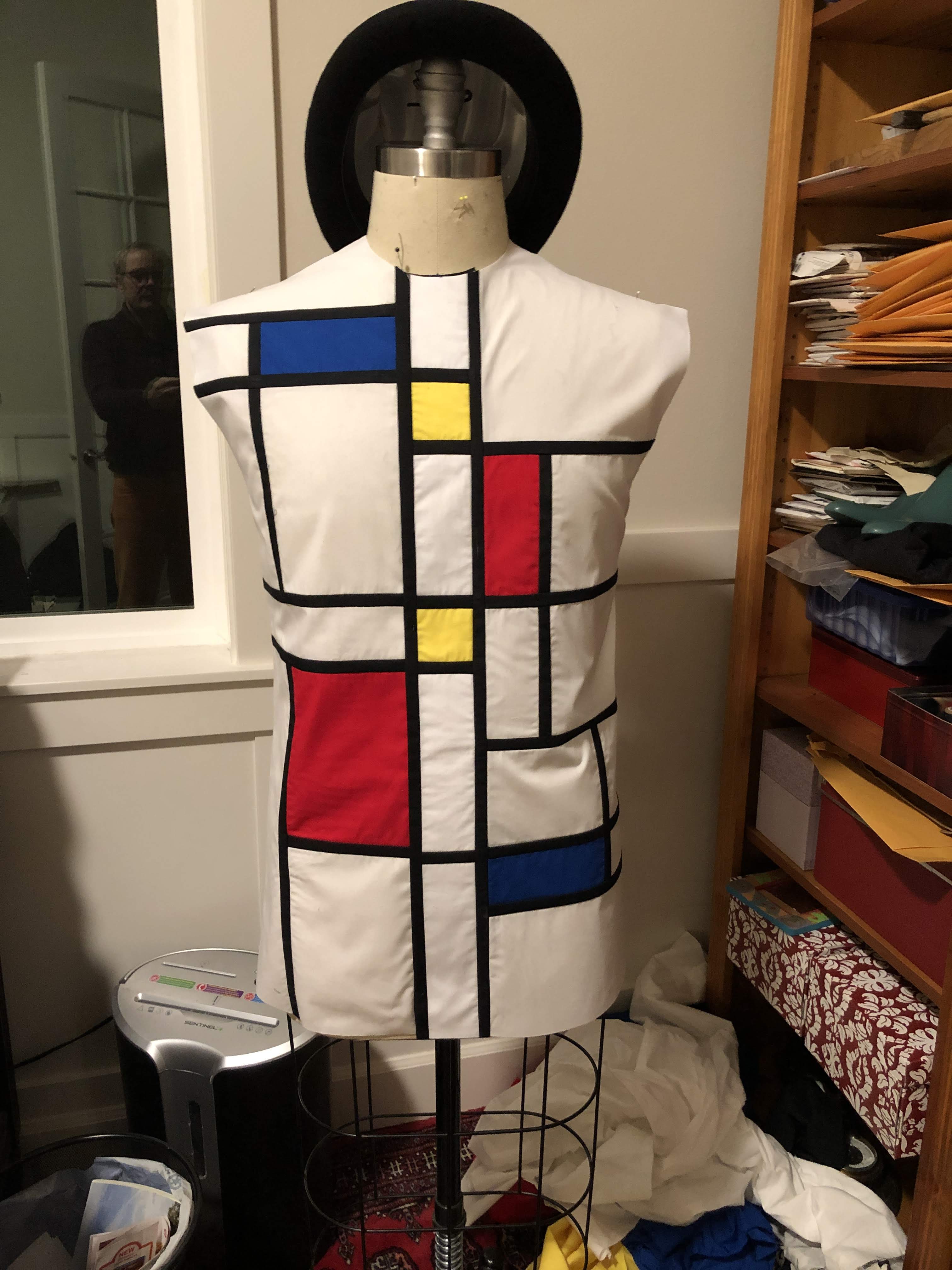
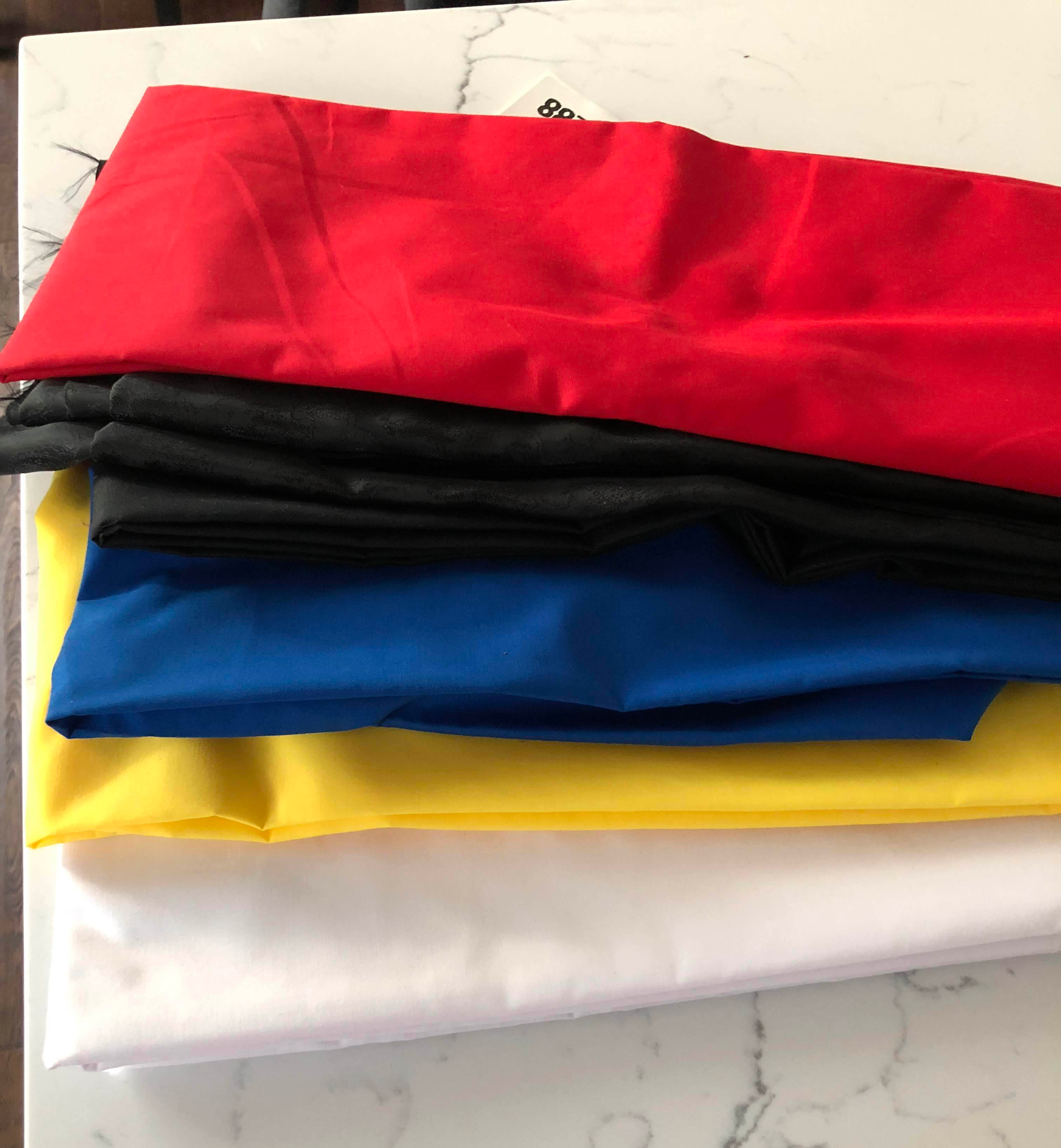
Now that I have the design turned into fabric, it is time to create a shirt.

While I was still making sketches, I considered continuing the design onto the back, and even the sleeves. And the more I thought about it, the less I liked the idea. Since one of the design ideas was that it should be wearable, the sleeves would move, and with it any lines that I’d try to continue onto them. In my mind, this would distract, instead of add to the design. And the pattern that I used for this shirt, a loose-fitted one, has pleats in the back where the yoke meets the rest of the fabric. This is a good feature, since I want the shirt to be wearable. But it also means that those pleats would seriously distort any type of geometric design I could come up with.

So I ditched that idea. And considering how much time it took to create the front, I’m not shedding any tears over that decision. I think I would have given up on the project if I had to do the back and the sleeves too.

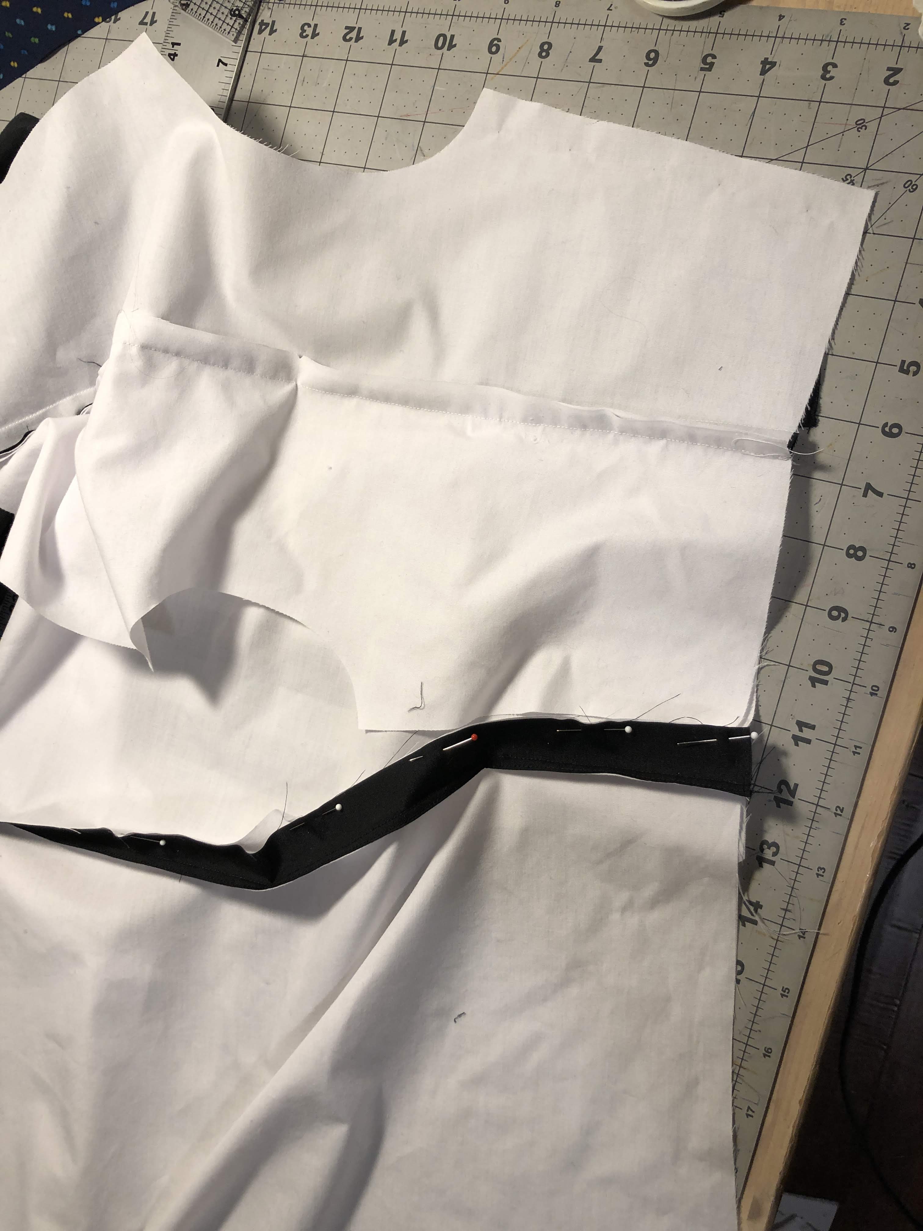
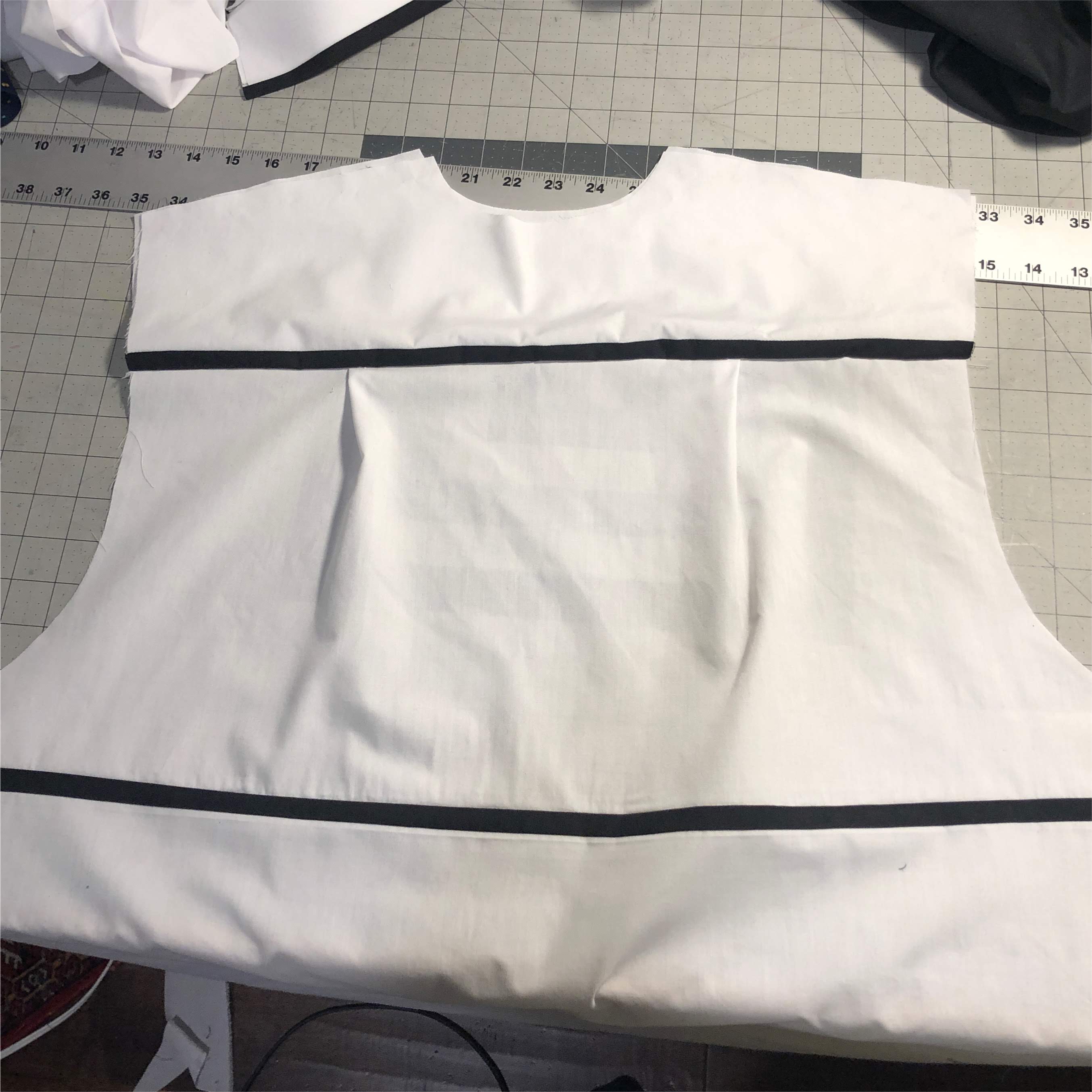
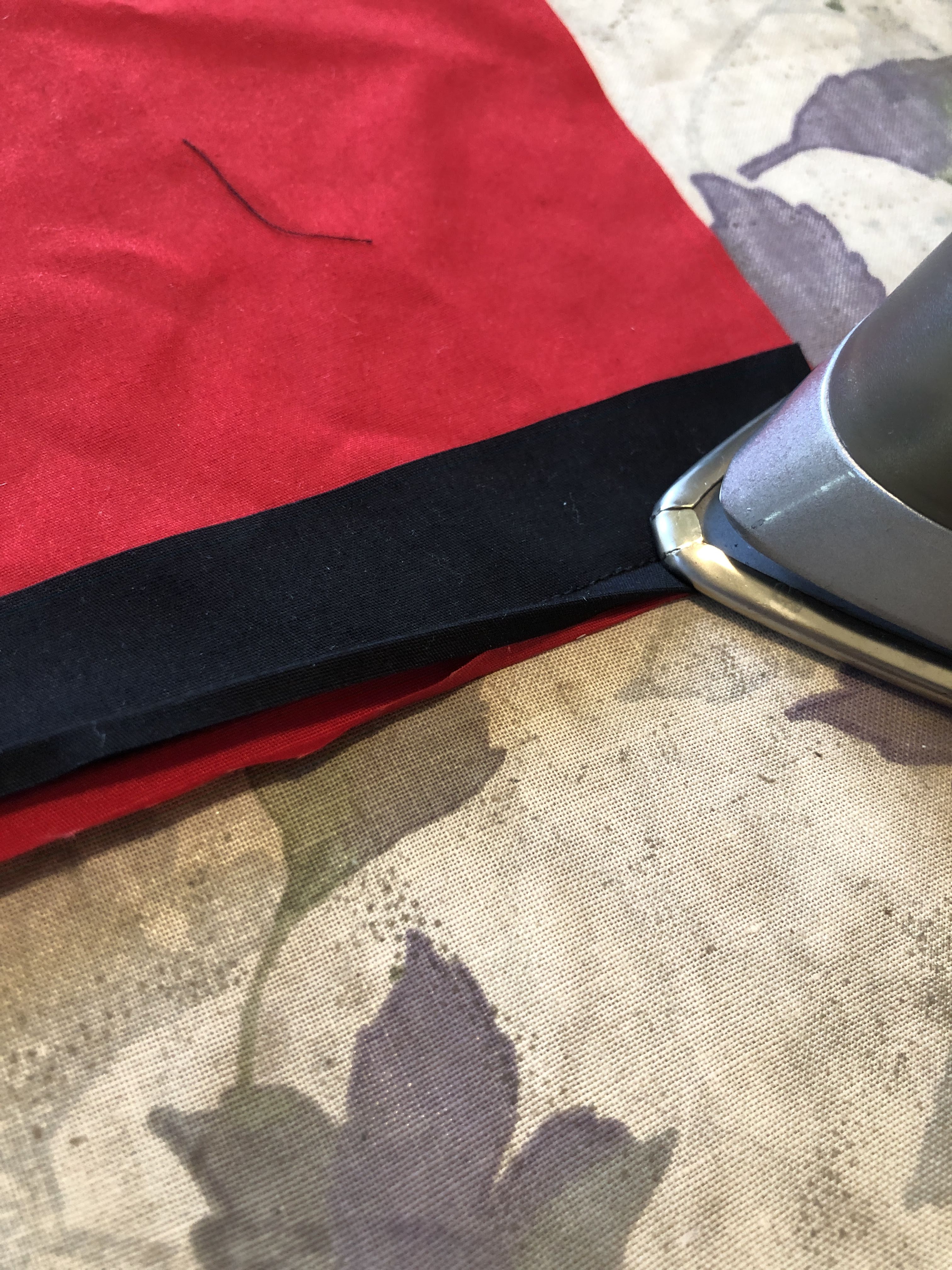
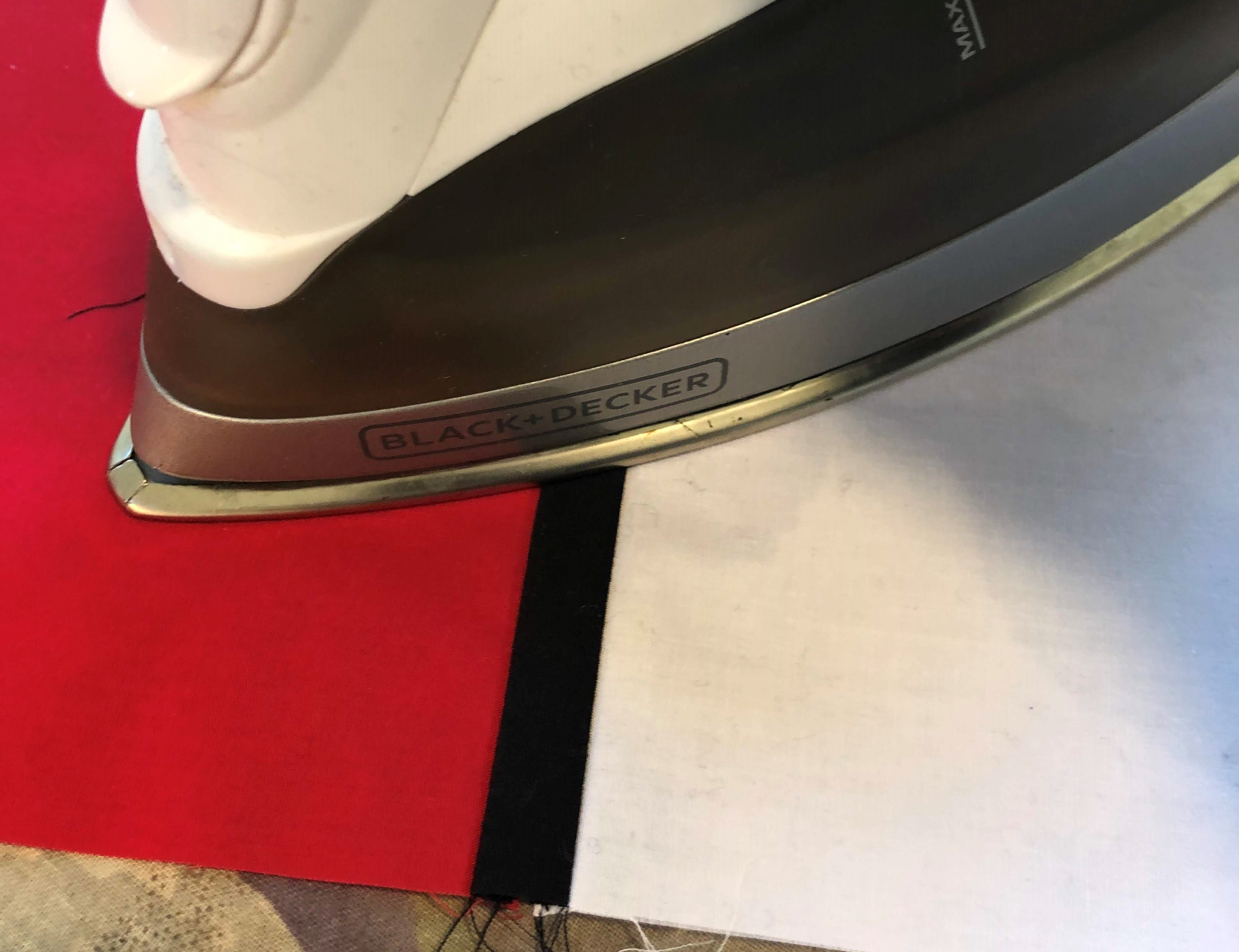
To make it not completely boring, I added a strip of black to the bottom of the back yoke. And while I was sewing that together I saw that there was one black line that ran all the way across the front. I couldn’t help myself, I cut the back where this line would match up and inserted another black strip of fabric. At least the back would some decoration.

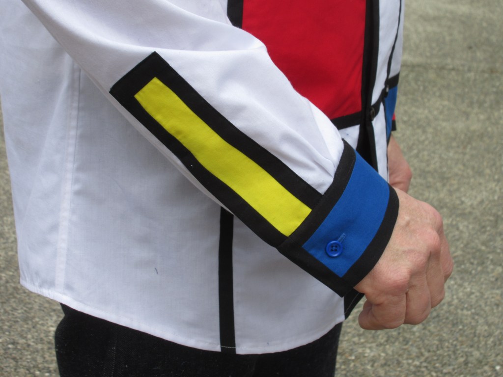
The sleeves were rather easy. Make a cuff that looks like a colour block, and do the same for the placket. The plackets would be yellow blocks with black lines, and the cuffs would be one red, and one blue. And I completely forgot to take any photos of the process.

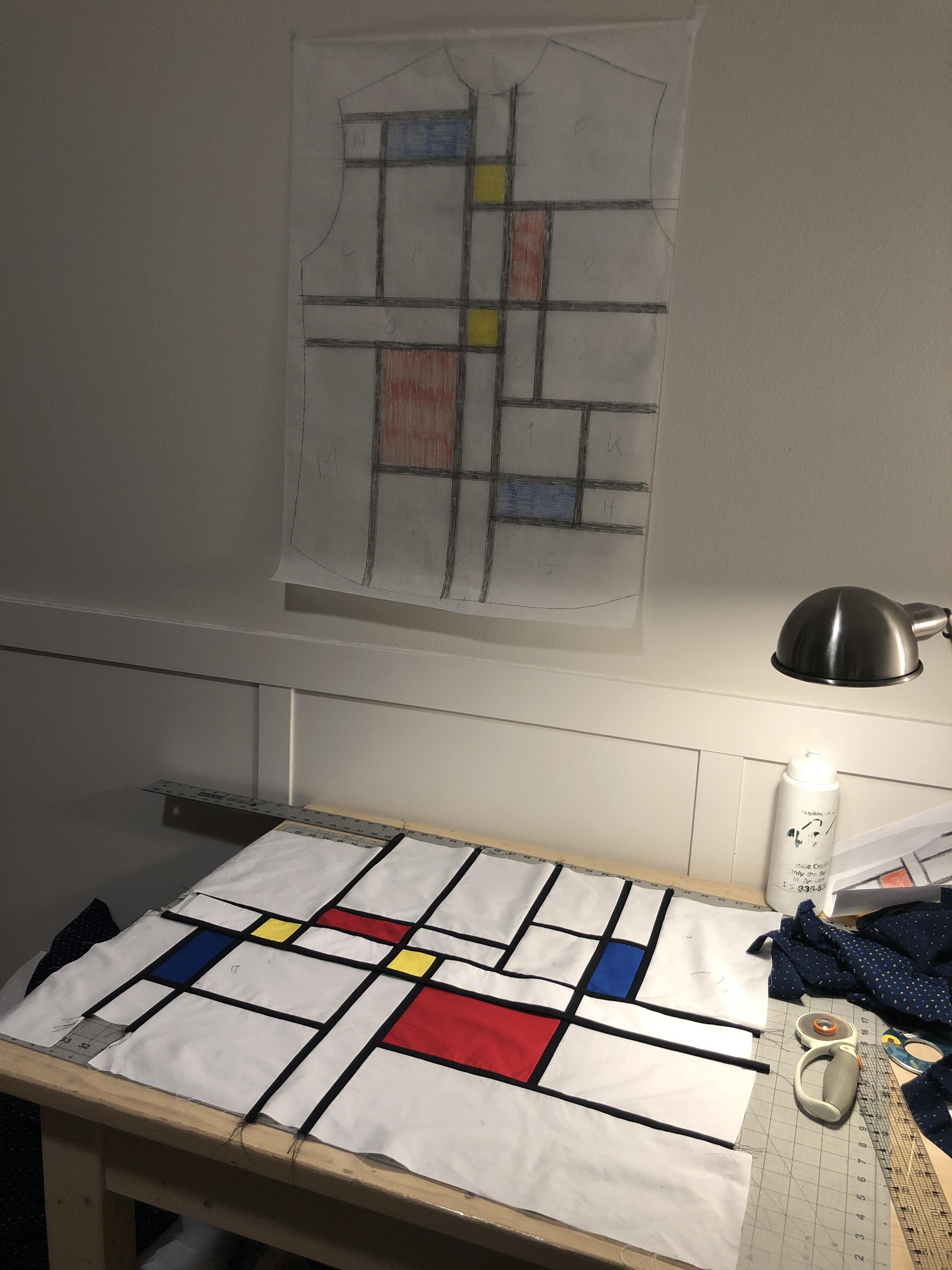
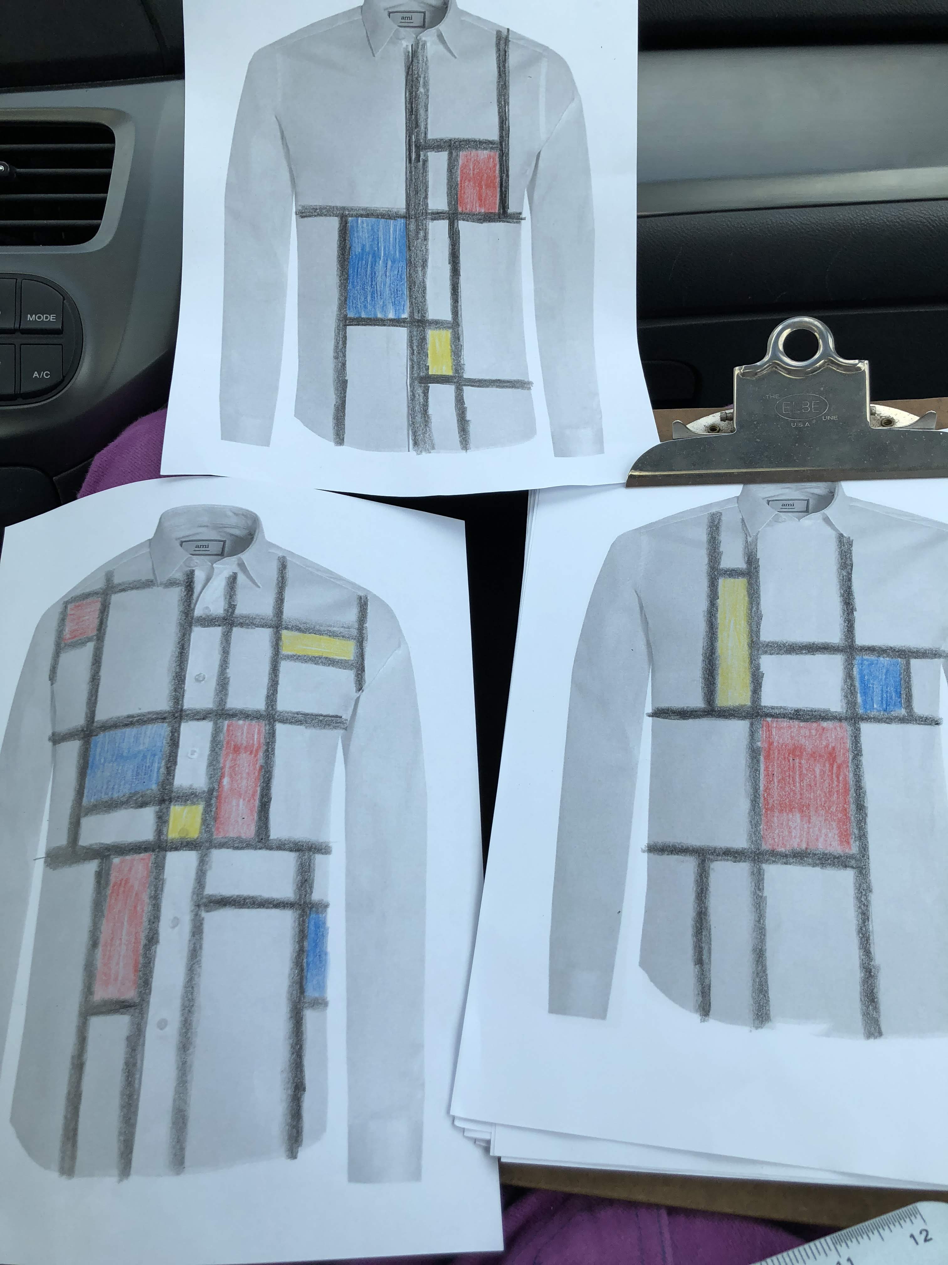
Now only one thing was left; the collar. And if you have been following me on this blog, or Instagram, you know that I have a thing for collars. I couldn’t let myself get away with something simple. So it was literally back to the drawing board.

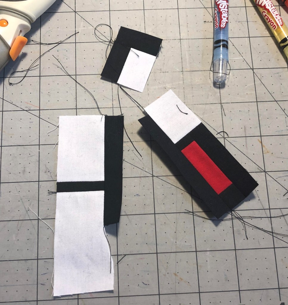
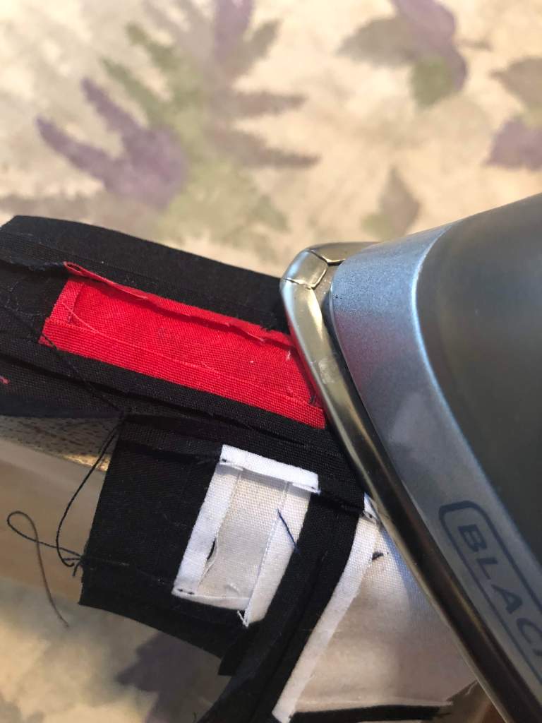
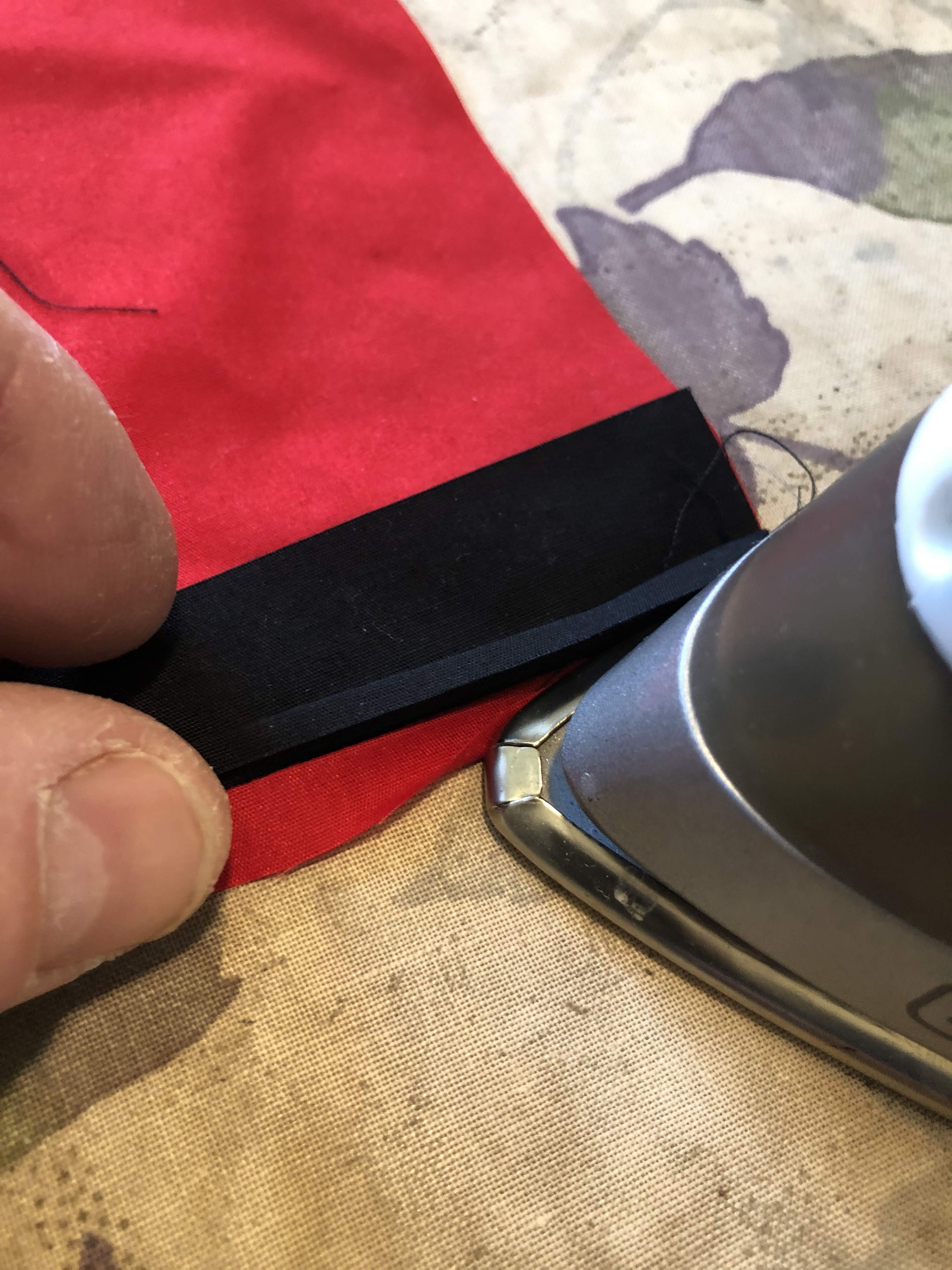
One thing was obvious; even though the black lines weren’t very wide, they were too big for a collar. The simple solution was to just make them half as wide. This would not be as big of an issue as I initially thought. These seams don’t have to be finished; they’re completely hidden inside the collar and only need to be pressed open. I would not have to make faux French seams here.

Initial design

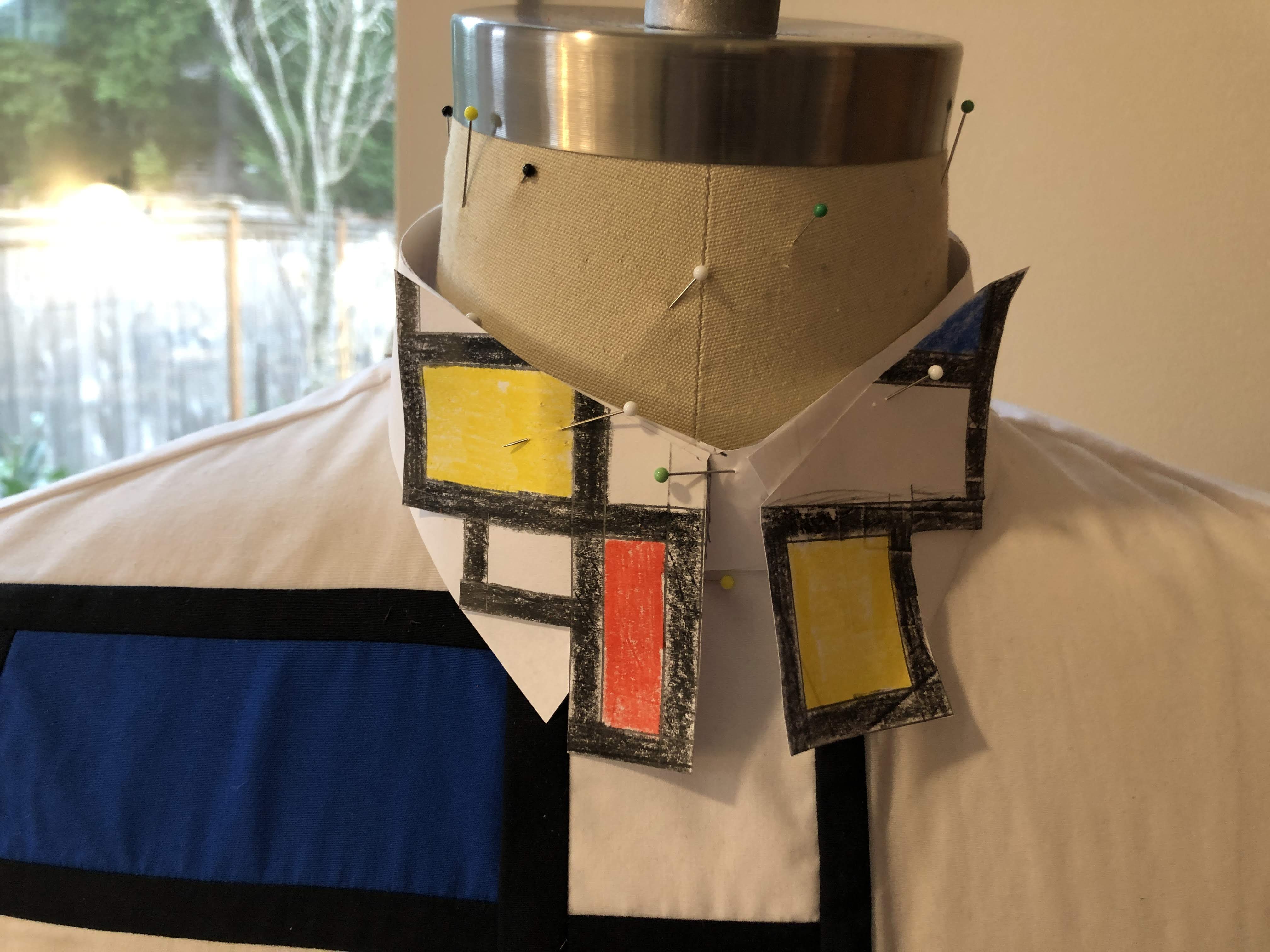
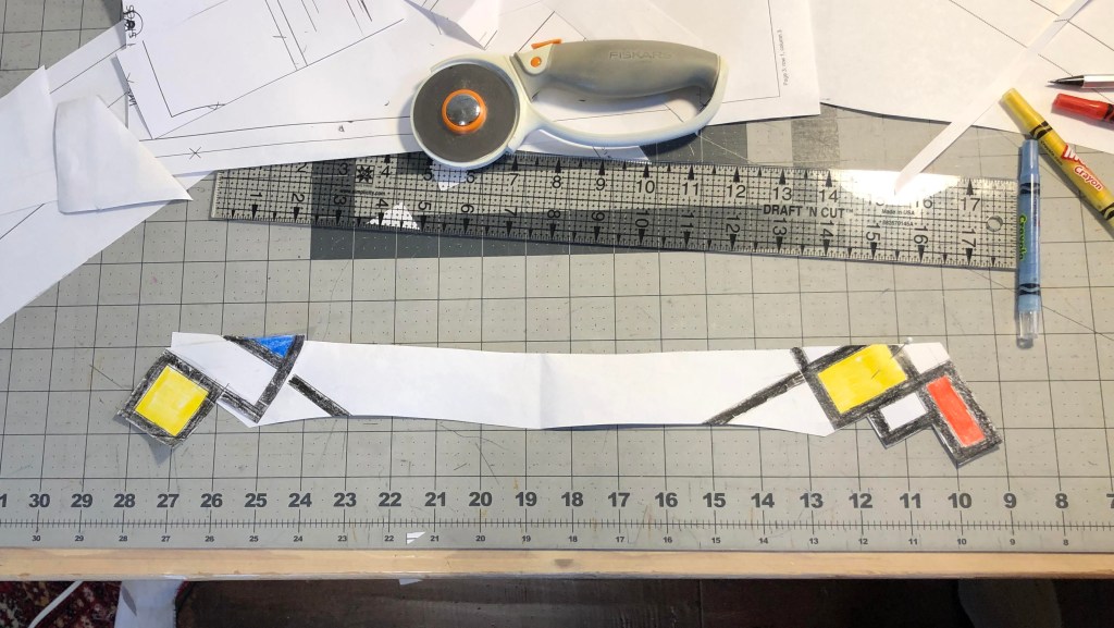
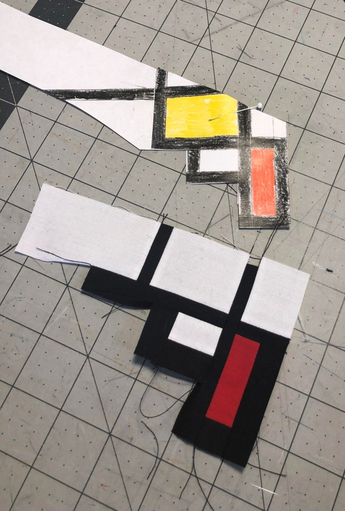
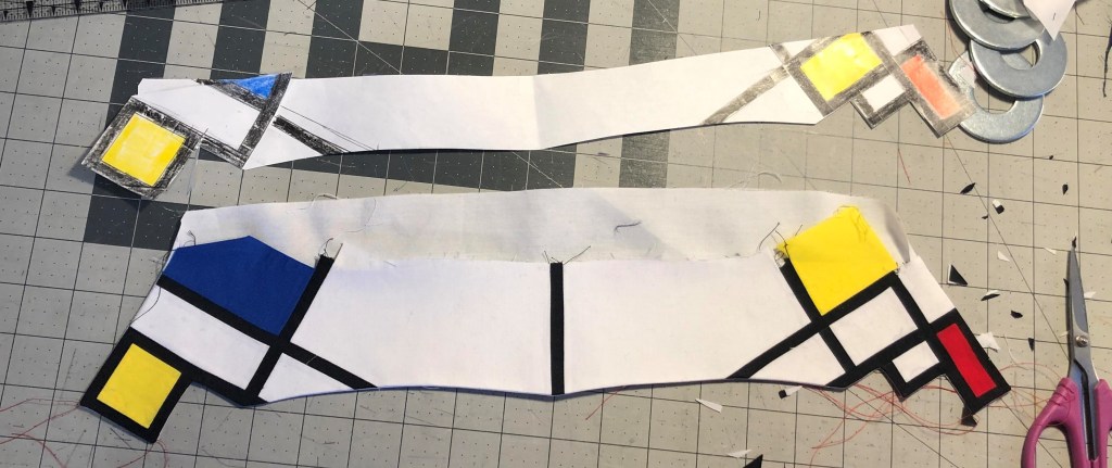
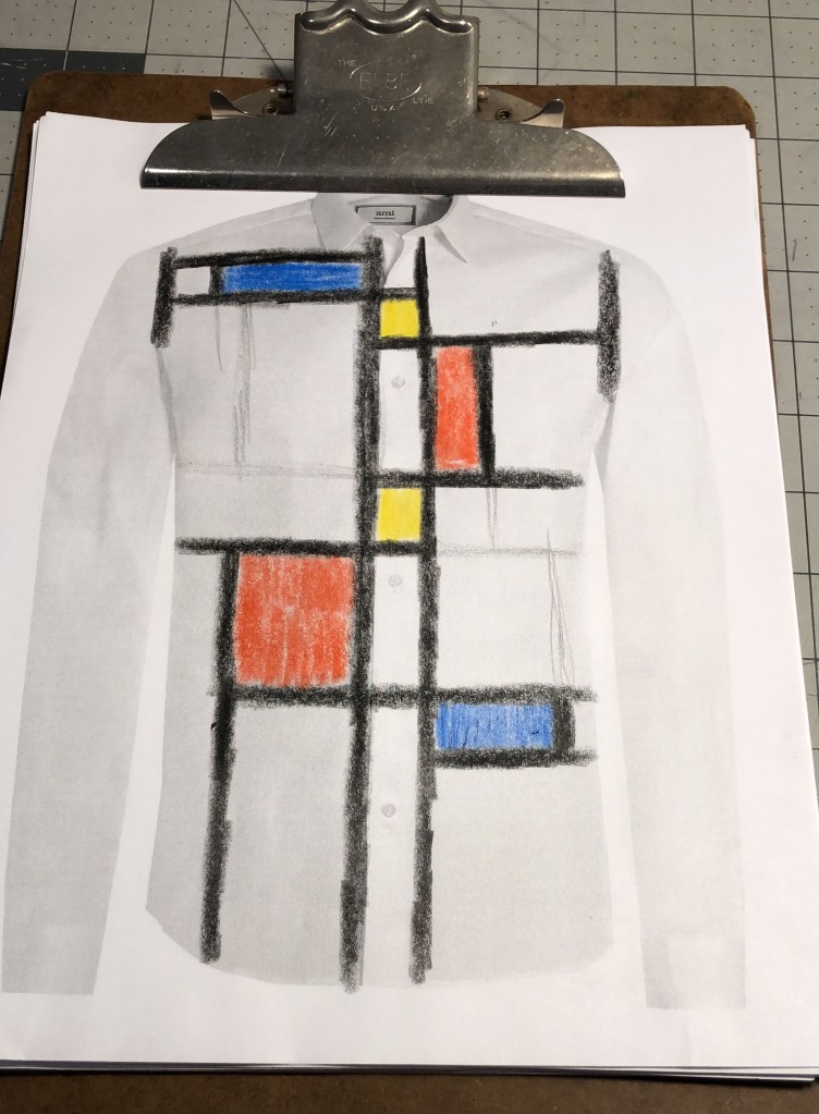
There wasn’t really a method to creating the design. I made a collar stand from paper and made a rough paper collar that I taped onto it. Then drew on that to see what I liked. Matching the lines up with the horizontal and vertical lines on the shirts was the most pleasing. And, of course, it had to be asymmetrical.

Transferring this design onto fabric was finicky. The precision required to make it look nice was even higher than with the front of the shirt. But I didn’t have to do the seams finishes, and there were a lot less seams.

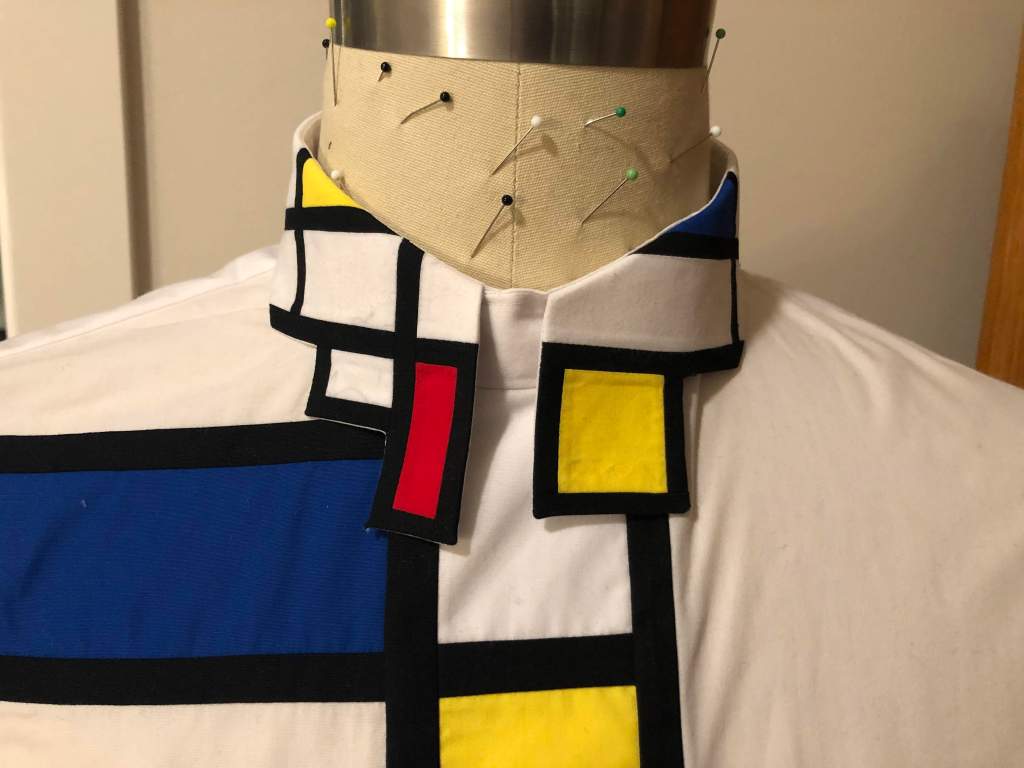
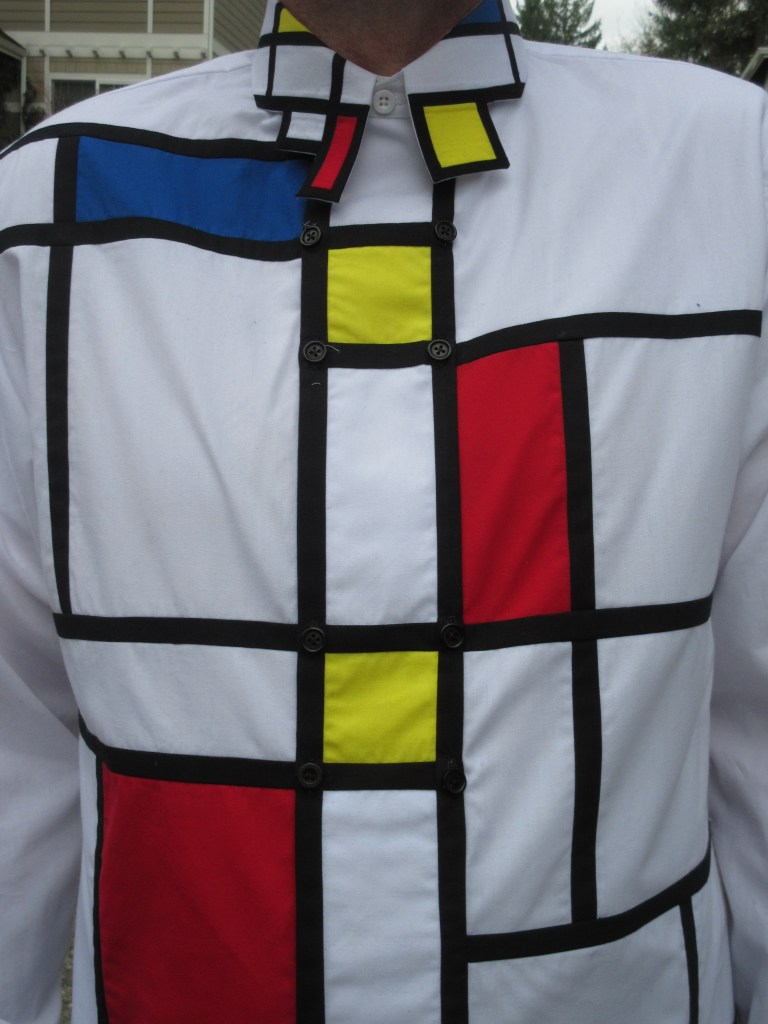
Now the only thing left were the buttons. I chose small black ones, on both sides of the wide placket. This would not disturb the symmetry, while being as unobtrusive as possible.

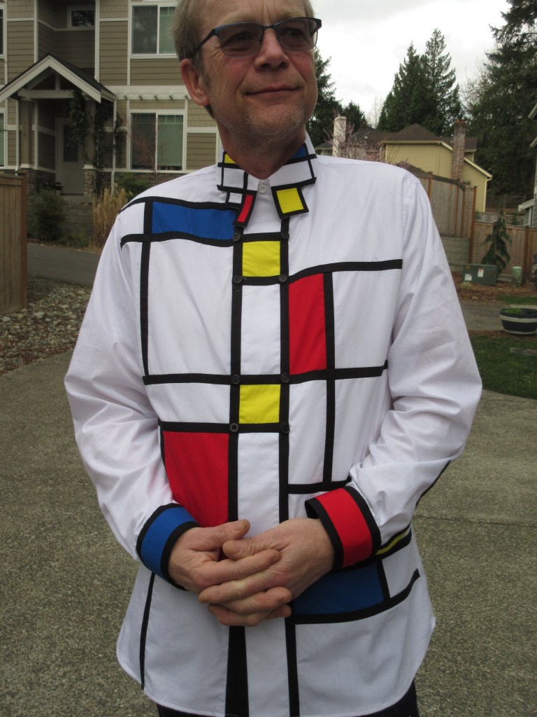
This was a great project, because it required so many new things of me. I needed to sketch, quilt, draft, and above all, not become frustrated with the tediousness of it all. There are a lot of things I learned, and there are many things I would do differently if I were to make another one. Yet, I’m very happy with it, and it feels good to finally (a year after the thought entered my brain) have it be part of my wardrobe.

Thanks for visiting!

Mondrian shirt – Construction

With the initial design finally done, it still had to be turned into real measurements. The best way to do this would be to make a full-sized front pattern piece from my favourite shirt pattern. This would allow me to see what decisions would look like.

The sketch provided me with the overall layout of the lines and areas. Now I had to decide the exact measurements of all those parts. One of the key dictating parts was the centre front. I figured that this should be a placket of sorts, and could therefore not be too wide. Having the black line be part of the placket seemed best to me. For the first try I used black lines that were 3/4″ wide. That only allowed for a middle section of about one and a half inches, too narrow for the design. So I shrunk the black lines to half an inch and the middle section to 2. This looked more balanced.

A lot of measuring followed and eventually I got to a representation of the sketch in exact measurements. At the same time I made a couple of small tweaks to the design.

Final design

The next phase would be figuring out the construction of the actual shirt. I had some requirements that had to be incorporated:

  • The design must be made of fabric. No printed patterns.
  • The shirt must be wearable.
  • All seams need to be finished.
  • No stitches on the right-side.

I quickly realised that although the colours of my fabric are very vibrant, the white, and the other colours to a lesser extend, are somewhat translucent. This is not an issue in and of itself, yet at the seams it may be. I would not want a darker colour to be shown through the lighter colour. So all seams would have to be pressed open, or towards the darker colour.

With my self-imposed limitation of not having any stitches or unfinished seams, it would have to be constructed with French seams. But I didn’t think I could be as precise with those as I would need for this project. And some experimentation proved me right, I couldn’t make those seams with a precision of less than 1/16″. I would have to sew the seam first, and then do the finish to get an acceptable result. No other solution would give me the precise parallel seams that something this geometrical requires. So the solution would have to be a mock French seam. Sew the seam first, iron both seam allowances into the seam, and then stitch them together. It would be just like a French seam, but with the stitches showing on the wrong side. Initial testing showed that this would be doable.

Going back to the final design, and the width of the black lines, I realised I did not have much space for the seam finishes. Two mock french seams would have to be pressed towards each other and fit inside the half an inch the black lines are wide. Seam allowances of 3/8″ would give me finished seams of 3/16″, and that would fit. It would be small and finicky, but it would fit.

With all of these decisions made, I could finally start cutting the pieces out. First a whole lot of long black strips, both vertically and horizontally cut, to keep the grain correctly. Then the coloured squares and rectangles. And then the white ones. I quickly figured out that I would have to keep track of each white piece, and where it is supposed to go. I wrote letters on the final design and attached pieces of paper to the white fabric as I cut them out. A whole stack of fabric pieces appeared that somehow had to become a shirt.

Now it just became an exercise of joining all the pieces together in the right sequence. I figured out before getting really into it that I had to join certain pieces before others. Basically try to do short seams before long ones.

I never dreamed it would be this much finicky work. Almost constant concentration for long periods of time. In the end I decided that I would only do half an hour to an hour at a time. Then do something easy – a different shirt – for the rest of the evening.

Slowly but surely the mosaic started to take shape. And after over 430 inches – almost 9 yards! – of mock French seams, I had the two front panels done.

Now all the was left for the fronts was to cut them out according to the pattern. That took quite a bit of courage. And measuring twice before cutting. Or maybe three times? I probably measured a dozen times before I dared to cut into it.

Thanks for reading.

Mondrian Shirt – The beginning

Almost a year ago I travelled to The Netherlands to visit my mom. I had a lot of time by myself while I was there and decided to play tourist in my own (former) country. In 2013, the Rijksmuseum opened its doors again after 10 years of renovation. I had been there since, and seen all the famous pieces that draw in all the tourists. But the museum is big, and there are a lot of things you will miss. So this time I decided to go there, skip all the usual, and find all the hidden gems. In the brochures online I had seen that there was a dress by Yves Saint Laurent, inspired by Piet Mondrian, a Dutch painter. This seemed like something I should not miss.

It is displayed all the way at the top of the building, in a far-away room. Unless you know what you’re looking for, are dedicated to see everything in the museum, or you’re lost, you would never find it.

This dress is part of a collection that YSL made in 1965 and became very popular after being on the cover of Vogue.

But to be honest, I wasn’t impressed. When I think of Piet Mondian, I think of more complex works. And the chair Rietveld made. This dress just left me wanting.

I spend quite some time looking at it from all angles. And I kept getting back at the same thought; I can do this better, with a shirt.

Weird, thinking you can improve on a famous designer. Although I wasn’t going to set out to create a new fashion trend, like YSL had done, it did seem rather arrogant. Yet the seed had been sown, and there was no turning back.

As with any bold adventure, it is very difficult to take the first step. I just let it play through my mind every now and then. The easy way would be to take one of his paintings, distribute it across some pattern piece templates on my computer, have it printed by Spoonflower onto fabric, and make a shirt. I have done that a couple of times with different art shirts. This seemed like the easy way out. And I didn’t think this would produce the vibrant colours that Mondrian used.

The alternative would be to create the cloth myself out of individual pieces of fabric. For that I would need to find the five colours – white, black, red, blue, yellow – in the same fabric. Looking at a couple of quilt shops did not provide me with what I wanted. The online store where I normally buy my trousers fabric, SellFabric.com, did.

The right weight, nice drape, nice colours, good price. The later was especially nice, considering I would need a yard of each colour and two or so of white. The only issue I found was that it bleeds like crazy. I must have washed each piece at least 6 times separately, adding Retayne to two of the washes. Eventually it stopped turning the water the same colour as the fabric. I’m not sure I trust it enough to actually wash the shirt once I’m finished.

With this hurdle completed, it was time to make the design. What an opportunity to procrastinate! “Let’s think about this for a while.
Of course, you can only tell yourself that for so long before you get cross with yourself.
I took an image of a dress shirt, removed as much detail as possible, and made a bunch of copies. This would let me design straight onto the ‘canvas’ and see what it would look like. One of my daughters provided crayons in red,blue, yellow, and black. Perfect!

This is a lot harder than I thought. The right combination of coloured areas, and the distribution of them and the black lines on the shirt, turned out to be anything but easy. All the while allowing for construction of the shirt.
I wanted the shirt to have a normal opening in the front. That basically gave me three options; a narrow placket the size of a black line, a normal sized placket, or a wide placket the size of the neck opening (like a double-breasted shirt). Using a narrow placket seemed to be problematic. The black lines should be really narrow, and that would allow the front to open between the buttons and show your chest. So I considered only a normal sized placket, and a wide one.

These to the left were my first three attempts. None of them I liked at all. Now, I’m not an artist, so that should not really have been a surprise to me.

Although I didn’t really know what was wrong with each of them, they did help me to sort of intuitively improve with each iteration. I would make one new attempt every couple of days to a week. The wide placket variation, which you see on the right in the photo, was voted out pretty soon in the process. I just didn’t really like how that looked. The numerous tries after that decision resulted in a table full of attempts and one I was finally happy with.

By now I was 8 months into the project, and needed another (procrastination) break.

Faces

When I’m busy with a difficult project, I sometimes take a little break to make something easy and familiar. This was the case with my winter coat project too. I felt that I had done enough pad stitching and basting, and needed to finish something. With plenty of fabric in my stash, it’s easy to just start a quick shirt.

img_1830.jpg

I’ve had this fabric for a while now, and even found some contrasting versions of it too. So I figured I’d make a quick shirt, with a contrasting collar. Maybe a contrasting front placket too.

img_1443
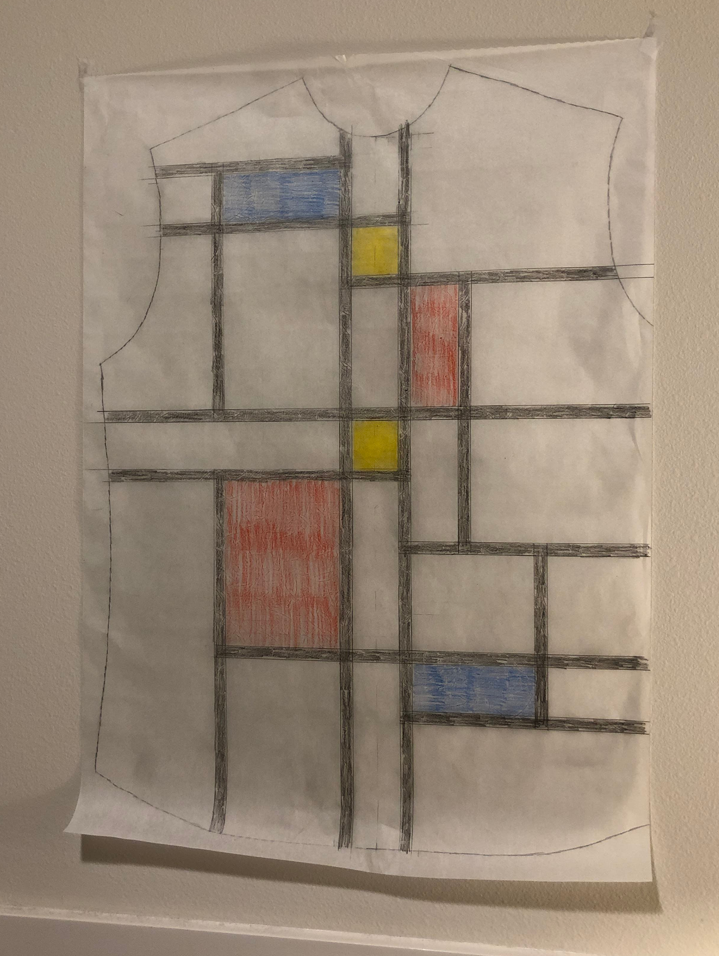
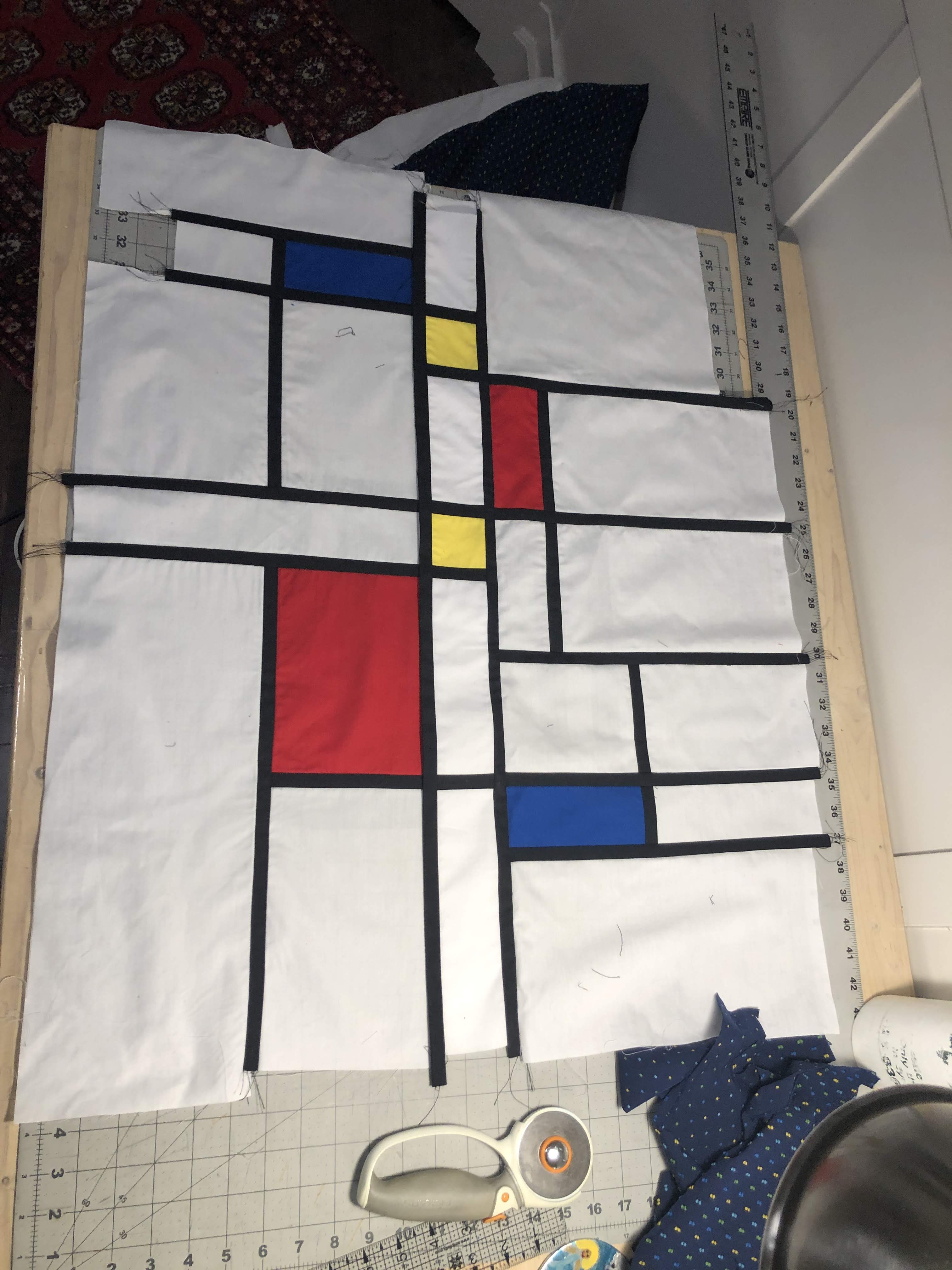
I cut out the fronts, making sure I would match the pattern in the front. Then cut out the contrasting placket, and matching that to the underlying front pieces too. To make sure I had everything lined up correctly, I laid it out on my cutting table. And then it happened; my brain started going off the deep end again.

“This looks really nice and symmetrical. Why shouldn’t I do that to the back too?”

“Surely the back of a shirt can have a placket!”

“That would create even more symmetry in the shirt!”

That didn’t seem too bad. I got the rest of the pattern pieces out of my envelope and started unfolding them. And then looked at the sleeve and sleeve placket pieces…

“Another placket! That should be contrasting too!”

“If we’re splitting the shirt into two halves along the front and back, shouldn’t we do that along the sides too?”

“Can I make a placket all the way along the sleeve?”

And thus another challenge was born. My mind seems to have this quality to make life difficult for itself. I had to figure out how I would make a placket in the sleeve that would run all the way up. Since the normal place for the placket is not in the middle of the sleeve piece, and I wanted the placket to run all the way up to, and beyond, the shoulder, it would have to be at a slight angle. And only the first 8 or so inches would have to be open, the rest would just lay on top of the sleeve fabric. I figured this would be best with a two-piece sleeve placket.

img_1448
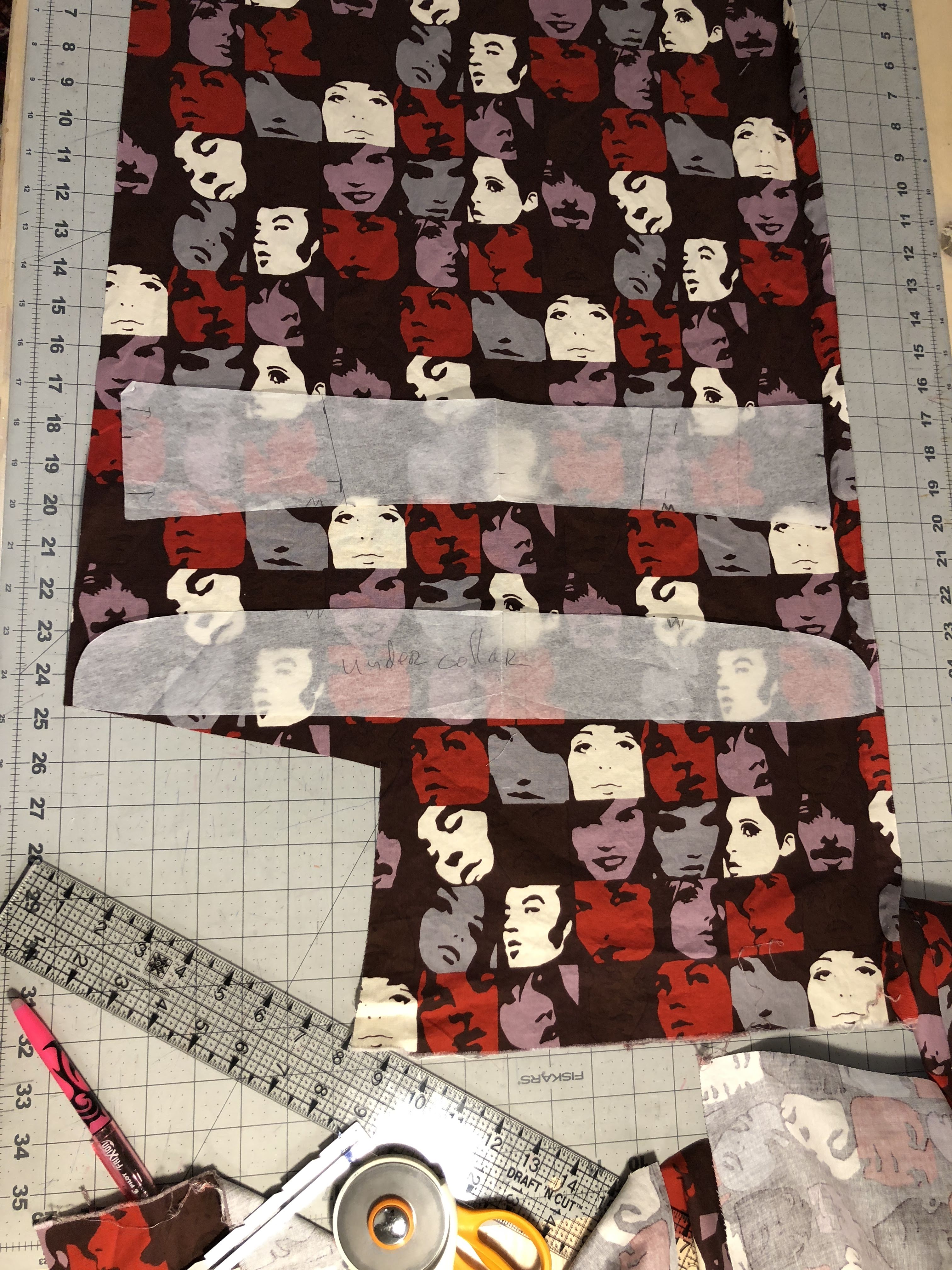
Of course, all of this would have to match the fabric pattern. So the challenge began of getting each piece out of the limited amount of contrasting fabric. With the placket on the sleeves being at a slight angle, that was not as easy as it initially sounded. I had to change how to cut the sleeves from the main fabric to accommodate what contrasting fabric I had left. And even then, trying to get the collar and collar band to fit in the remaining fabric almost didn’t work.

The construction of the shirt was relatively easy. The ‘placket’ in the back and yoke is just a strip of fabric that is top-stitched onto each piece. The part of the side plackets that’s on the shoulder is sewn into the shoulder seam on one side, and top-stitched on the other side. Getting the pattern-matching correct here took a little effort, but not too bad.

The sleeves were more involved. I first cut out a strip of fabric that would match where it would end up. The bottom part of this had an extension on one side to accommodate the opening part.

A sleeve placket is sewn on the wrong side of the fabric, and then folded into place. This placket had to then exactly match the underlying pattern of the sleeve. To accomplish that, I basted it first. This gave me the opportunity to check the vertical alignment. The horizontal alignment doesn’t have to be too precise, because you can adjust that with where you make the fold by the initial seam. Sew a little inside the intended line and you have some playing room. Top stitching needs to be done in two phases, one above and one below the opening of the placket.

I really like the contrasting ‘stripe’ on the back and the sides. It is not something I would do on all my shirts, but I think it works well on this one. A little splash of colour in the monochrome theme brightens it up some.

One pocket from the contrasting fabric was all that I could do, there just wasn’t a matching piece left for the other pocket. And I think that looks fine.

img_1461 (2)

Thanks for reading!